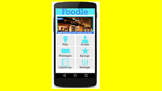
Products that would require a visualisation diagram as a planning document would be ones such as magazines, posters, leaflets, websites or app (home screen / page), CD or DVD cover, a level for a game.
Example of website and app home screens:

Common features denoted:
- Logo.( At the top of the page, largest form of text, represents the brand and product)
- Different manual options (home, notifications, profile, upload, search)
- House style colours. (reflect the genre / theme of the product.)
- Hyperlinks (interactive buttons, allow you too navigate the app / website)
- Font (represents the genre / theme of the product)
When labelling your visualisation diagram list the connotations, annotations and denotations of all assets within your drawing.
How are your assets going to appeal to your audience / benefit them? e.g. if the target audience was of both males and females you should use colours such as black and white as they are gender neutral to appeal to both groups of people.
If you had to draw a design for an app draw the phone within the box.
You're getting marks for content, fitness of purpose and use of annotations.
- Content
what your visualisation diagram includes. e.g. has it got a logo? slogan? or buttons? Does it look like the product and have you includes key features.
- Fitness for purpose
Just like with content, this one is about the features of what you have drawn being relevant to the brief / scenario.
- Annotations
Making detailed notes to explain elements such as the house style, why it appeals to the target audience and the brief. (you wouldn't have to add notes or arrows with notes to documents such as storyboards as they include them within the document).


No comments:
Post a Comment